Comments on "Map Theory: Function and Form"
Pages: (1) [ 1 ]
2009-08-30
:p
Just glad I could be of assistance!
2009-08-28
In the spirit of
being a noob, I salute you, atob.
2009-08-22
really useful...
......
| Demo Data |
|---|
Thats why I am playing all your maps atob.
2009-06-30
Absolutely wonderful.
I use this as a link for newer members :)
2009-06-20
that was amazing
I am truly enlightened by this. Thank you. On another note, I think shortshift should be included on that list. I can personally see when a map was inspired by him.
2009-06-20
I've already read the guide,
and yet, I'm still a bit surprised and flattered to be on that list. Nice work, atob, as always.
spot on
<3
<3
2009-06-19
I'm not the owner.
2009-06-19
honestly I
had no idea that you were the owner and operator of this site...lol now I feel like a d-bag for being disrespectful with my responses...I apologise :)
2009-06-17
This is awesome.
And the two switches next to the bounceblock is the best thing I've seen lately.
Also, nice idea of posting this here. My respect is growing.
Also, nice idea of posting this here. My respect is growing.
2009-06-17
Printscreen.
Then Ifranview or Photoshop.
Look up making animated .gif files if you're interested in those.
Look up making animated .gif files if you're interested in those.
2009-06-17
How do you do those pics?
2009-06-16
Just-messing-around-AGD-3
This was so useful to me.
<3
<3
| Demo Data |
|---|
2009-06-16
:p
there's enough self-reference in the guide to sate my ego, but thanks <3
2009-06-16
Good list.
But you forgot yourself.
Meh demo ended prematurely by lag.
Meh demo ended prematurely by lag.
| Demo Data |
|---|
2009-06-16
I'm on the same
list as so many good authors. Yay for me =)
The following should be considered only one source of reference when researching ideas for mapping. This is a heavily biased and personal opinion of the qualities of mapping and as such should be referenced with other sources to build a well rounded basis. I'll try avoid getting too in-depth and over articulating points, instead I'll focus on short paragraphs leading to various visual and playable examples to further the understanding.
For me - for a map to be truly exceptional - there are two criteria that need to be fully satisfied when creating a map: The 'Function' and the 'Form'. Now, this may seem obvious, but more often than not one is neglected for (sometimes even in spite of) the other.
My view is this: Good gameplay is enhanced by artistic style and atmosphere. If you take two maps with the exact same gameplay and leave one version aesthetically unrefined and clunky, while the other is highly refined and shaped to produce a strong and striking visual, the latter will be the one accepted by most as the more enjoyable experience.
The end result must strike a balance between enjoyable mechanics built together to produce a coherent and satisfying play, and a visual that enhances by adding a sense of atmosphere and style that evokes certain responses and adds to the visceral experience.
2009-06-16
[001]
Maps are built with a collection of mechanics. What are mechanics?
Well, mechanics are the technical aspects of the map. The cogs and gears if you will. They're produced by building objects and tiles in certain ways to produce specific gameplay effects.
-
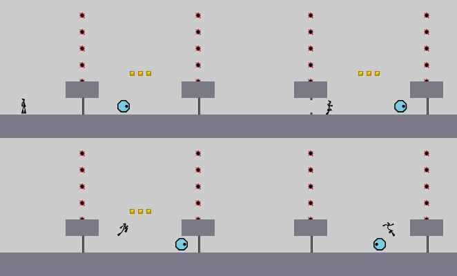
In the above we have a simple example of gameplay mechanics. We have a structure closed off by mines and automatic doors, the drone cannot break through the doors and is trapped in a forwards/backwards patrol. By timing your entrance you can enter the structure, leap over the drone, snatch the gold, and exit in one motion.
Remember when building these devices that most of the time less is more! Of course, this comes down to preference, but I find it's always best to keep the core of the mechanics as clean as possible. This will allow you to control how the gameplay unfolds with maximum precision, and avoid applying an unneeded layer of frustration.
Tip: If you prefer a more cluttered style, then work out a clear path(s) and place superficial objects around the path(s) to add the cluttered feel without detracting from the play.
Well, mechanics are the technical aspects of the map. The cogs and gears if you will. They're produced by building objects and tiles in certain ways to produce specific gameplay effects.

-
In the above we have a simple example of gameplay mechanics. We have a structure closed off by mines and automatic doors, the drone cannot break through the doors and is trapped in a forwards/backwards patrol. By timing your entrance you can enter the structure, leap over the drone, snatch the gold, and exit in one motion.
Remember when building these devices that most of the time less is more! Of course, this comes down to preference, but I find it's always best to keep the core of the mechanics as clean as possible. This will allow you to control how the gameplay unfolds with maximum precision, and avoid applying an unneeded layer of frustration.
Tip: If you prefer a more cluttered style, then work out a clear path(s) and place superficial objects around the path(s) to add the cluttered feel without detracting from the play.
2009-06-16
[002]
A map is built up of interlocking mechanics and devices. The real trick with gameplay is to sew a thread that runs through your map linking each part to the next. This can be done in a multitude of ways. Examples being:
01 A difficulty curve that increases steadily as the map progresses.
02 A repeated theme that creates a pattern with a slowly building intensity through repetition
03 A progressive build of repeated base mechanics
etc...
A map that just throws a load of unrelated - even if otherwise well built - mechanics at you, will most likely not be as rewarding an experience as one that's been threaded with intelligent care.
01 'Mother Thumping Impossible' - by blue_tetris [nmaps.net]
http://nmaps.net/5080
-
02 'prologue: darker clouds' - by astheoceansblue [nmaps.net]
http://nmaps.net/147513
-
03 '05-2: Shadow of a Doubt' - by Myrrhman [nmaps.net]
http://nmaps.net/132547
-
2009-06-16
[003]
Enemy use in general can be tricky. There are many pitfalls to avoid when deciding which enemies to use (and - just as importantly which not!). Pitfalls include: too many enemies inducing a cluttered feel and actual lag to play, too many enemy types resulting in an incoherent play, poor choice of enemy combination for a given area, etc... There are several ways to avoid these. Examples being:
01 Use of a single enemy type to create a theme
02 Use of complimenting enemies to produce specific gameplay
03 Enclosing areas to allow use for multiple enemy types without overspill.
etc...
These are some of the clearest examples of how to use enemies effectively, there are many more for you to discover on your own. [nmaps.net]
01 'Advanced Robotics' - by tktktk [nmaps.net]
http://nmaps.net/32145
-
02 'Bubblegum' - by krusch [nmaps.net]
http://nmaps.net/54532
-
03 'Towers of Wib' by Sendy [nmaps.net]
http://nmaps.net/98557
-
2009-06-16
[004]
There are many types of gameplay an author could potentially want to produce. From intense and action packed, to isolated and open. Below is one example of a gameplay type and how to refine it to avoid common mistakes.
We'll concentrate on 'intense and action packed'. It's only one example, so there's plenty more for you to discover by yourself [nmaps.net].
If you're attempting to build an intense experience, it's best to calculate instead of just heaping on as many enemies as you can.
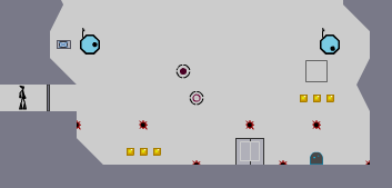
Contained in the spoilers below are two examples of attempting intensity. The first is overdone and produces a frustrating and unsatisfying experience, the second has been refined to keep the core of the idea but to allow an amount of freedom while maintaining the desired effect.
Map data is included with each image for you to try the examples for yourself and see the advice in practice.
Overdone.
-
In the above example, there are too many enemies and not enough room to maneuver. Even when creating intensity it's still important to allow room to breath. Simply piling on enemies and obstacles will most likely create a frustrating and tiring experience for the player.
Map data: Click. [uploadit.org]
Refined.

In this example, we maintain multiple enemies and obstacles, but we create a little more space in between. Now the player has enough room to move freely and choose their own path but the enemies remain persistent and the intensity is intact.
Map data: Click. [uploadit.org]
We'll concentrate on 'intense and action packed'. It's only one example, so there's plenty more for you to discover by yourself [nmaps.net].
If you're attempting to build an intense experience, it's best to calculate instead of just heaping on as many enemies as you can.
Contained in the spoilers below are two examples of attempting intensity. The first is overdone and produces a frustrating and unsatisfying experience, the second has been refined to keep the core of the idea but to allow an amount of freedom while maintaining the desired effect.
Map data is included with each image for you to try the examples for yourself and see the advice in practice.
Overdone.

-
In the above example, there are too many enemies and not enough room to maneuver. Even when creating intensity it's still important to allow room to breath. Simply piling on enemies and obstacles will most likely create a frustrating and tiring experience for the player.
Map data: Click. [uploadit.org]
Refined.

In this example, we maintain multiple enemies and obstacles, but we create a little more space in between. Now the player has enough room to move freely and choose their own path but the enemies remain persistent and the intensity is intact.
Map data: Click. [uploadit.org]
2009-06-16
[005]
The importance of aesthetics are often downplayed when considering how to build a successful map. There's much more to creating visuals than simply making a map look attractive in the generic sense. There are a few ways to elaborate the aesthetics to produce gameplay enhancing visual devices that will add to a player's experience and improve the quality of your map making skills in general.
In this section, I'll be using examples of my own work to provide references for my theories. Not only am I most familiar with my own success in this area, but it'll satisfy my daily narcissism quota quite nicely.
In this section, I'll be using examples of my own work to provide references for my theories. Not only am I most familiar with my own success in this area, but it'll satisfy my daily narcissism quota quite nicely.
2009-06-16
[006]
The first thing to consider when creating aesthetics is the degree of quality you wish to achieve. Do you want to just throw the visuals together around the gameplay as an afterthought, or spend time refining them to enhance the experience as much as possible?
This is the first block that most authors find themselves stumbling over.
Below are two examples of a section of a maps with exactly the same gameplay mechanics. Example one shows a lack of care with the aesthetics while example two highlights the benefits of spending the extra time developing the visuals.
Map data is included for you to try the play for yourself and to feel the difference the extra effort can make.
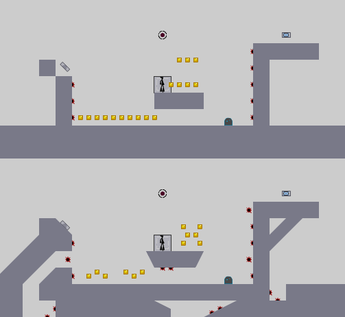
The first image uses messy and minimal tiles that do little to enhance the gameplay. Objects are placed without care for look, merely to work for the intended play.
The second shows how embellishments in the tiles and more care with the placement of objects can enhance the user's experience by catering for not only the core gameplay, but also the appreciation a well crafted visual can give us.
-
First map data: Click. [uploadit.org]
Second map data: Click. [uploadit.org]
This is the first block that most authors find themselves stumbling over.
Below are two examples of a section of a maps with exactly the same gameplay mechanics. Example one shows a lack of care with the aesthetics while example two highlights the benefits of spending the extra time developing the visuals.
Map data is included for you to try the play for yourself and to feel the difference the extra effort can make.

The first image uses messy and minimal tiles that do little to enhance the gameplay. Objects are placed without care for look, merely to work for the intended play.
The second shows how embellishments in the tiles and more care with the placement of objects can enhance the user's experience by catering for not only the core gameplay, but also the appreciation a well crafted visual can give us.
-
First map data: Click. [uploadit.org]
Second map data: Click. [uploadit.org]
2009-06-16
[007]
Distinct visual themes are a very precise way to inject atmosphere into your maps. There are many different ways to do this. One of the most obvious being creating shapes out of tiles that represent or allude to real world objects, and then building sceneries with them to produce a sense of adventure.
These types of thematic shapes are used in a few ways.
01 Used alone, thematic shapes can add a light stylised quality to a map
02 Used as a starting block to build up a fully themed tileset referencing/alluding to a real world scene
03 Letting your imagination run with a themed idea to create an abstract quality
etc...
These ways (and more) can be equally as effective in producing an atmosphere.
01 'El Pineo' - by me [nmaps.net]
http://nmaps.net/54548
-
02 'Selachophobia' - by me [nmaps.net]
http://nmaps.net/56367
-
03 'the great trickster' - by me [nmaps.net]
http://nmaps.net/128565
2009-06-16
[008]
Atmosphere in a more general sense is much trickier to master. It's something that's developed over a longer period of time and only once you've mastered the basics. It's something to strive for, certainly, but not at the detriment of the aspects of mapping in general.
For this reason, advice here is quite difficult to articulate. What I'd suggest is consistency and progression with shapes and not feeling the need to clutter all available space but also to add superficial flourishes in both tiles and/or objects (adding areas/objects that are inaccessible or otherwise unimportant to the core gameplay, but add to the overall sense of satisfaction and adventure).
01 'Broke Black Mesa' - by me [nmaps.net]
http://nmaps.net/148329
-
02 '301: Intersect Machima' - by me [nmaps.net]
http://nmaps.net/143380
-
03 'machina root' - by me [nmaps.net]
http://nmaps.net/83939
2009-06-16
[009]
Once you feel you have a handle on both aspects of mapping, it's time to bring them together to produce the most effective and enjoyable experience you can. This is the dangerous part, it's here that too much opinion can be given as advice and decisions can be made for you. This is where your own creativity comes to fruition, it's up to you now to take the aspects of this guide that you think will aid you on your journey and get mapping!
So, sadly, it's almost time for us to part company... but not before...
So, sadly, it's almost time for us to part company... but not before...
2009-06-16
[010]
...we come to arguably the most controversial aspect of mapping: Personal Style. Some consider the development and application of personal style to be the epitome of mapping potential, while others consider it to potentially be the most stifling and detrimental course to set yourself on.
I apply the former way of thinking.
I consider it almost vital to develop a way of creating maps that helps them stand out as your own. The trick is to not only arrive at the point where your maps are easily identifiable as your own, but also to constantly evolve your style so your own archive doesn't become saturated with cut and paste concepts and ideas.
The real trick is to not strive too hard to be original, let it come slowly and naturally. Develop at a comfortable pace instead of pushing yourself into contrived and pretentious designs just for the sake of standing out.
To end, I will provide examples of authors who I perceive as having achieved this. Those who have, over time, created unique and original designs and gameplay which inspired the community. There are many more for you to discover yourself [nmaps.net], so get yourself to NUMA and start playing!
nevermore [nmaps.net]
stepself [nmaps.net]
Evil_Bob [nmaps.net]
tktktk [nmaps.net]
barabajagal [nmaps.net]
krusch [nmaps.net]
Losttortuga [nmaps.net]
lord_day [nmaps.net]
littleviking001 [nmaps.net]
yahoozy [nmaps.net]
Brttrx [nmaps.net]
Sendy [nmaps.net]
Lucidium [nmaps.net]
PALEMOON [nmaps.net]
AMomentLikeThis [nmaps.net]
formica [nmaps.net]
Maximo [n.wikia.com]
Pheidippides [nmaps.net]


werdna94
Go to the bottom