


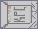
THE TRUE COURSE OF DEATH

Hover over the thumbnail for a full-size version.
| Author | samfisherofwoe |
|---|---|
| Tags | action author:samfisherofwoe cool hard pro unrated |
| Created | 2008-09-10 |
| Last Modified | 2008-09-12 |
| Rating | 2 more votes required for a rating. |
| Map Data | |
| Description | the other ones rockets didnt work and i fixed that it is now much harder at the beggining. and no its not impossible. |
Other maps by this author
 |
 |
 |
 |
| Iron Maiden Triple Threat | Run to the Hills | buckethead | Iron Maiden |
Comments
Pages: (0)
2008-09-12
I've got to agree with geti...
Alright, I'm not going to jump all over you, because you're obviously new at making maps; but you should know right now that this map demonstrates a lot of things that make a bad map.
First, you've overloaded it with objects and enemies; there's no point in having so many mines so close together. One mine would suffice in places where you have many more. You've placed too many rockets and gauss turrets along the bottom row, roughly 25 of each where only a few are needed. Same with the upper left corner, there's simply no point in having more than one there. Essentially, the problem is that after more than a few of one kind of enemy in one area, it doesn't become any more difficult; it just lags the game. The cliche holds true: less is more.
Second, this map has no idea or theme besides "don't die". We all know you're not supposed to die. Nearly every map has one technique that is central to it besides running away, such as jumping off of walls or slopes, avoiding zap drones, et cetera. This is just a "mad dash to the finish".
Third, and sorry if this is too harsh, but the map is ugly. Use some symmetry (not complete, but some) and neatness, it will go a long way. If you're going to write something with gold, or mines, or what-have-you, try to make it cleaner and more regular. To me, personally, ugly object text is a huge turn-off in a map.
I hope I've given some helpful critiquing. The best advice I can give is to look at maps that are praised, and figure out why people like them so much.

2008-09-10
whats wrong with this one?
i dont see the problem it looks challenging and awesome

2008-09-10
wow really?
sorry, ive been playing for about a 2 years or so now, its kinda obvious to dodge the enemies by now lol.
anyway, dont be discouraged, just make better maps ;) XD
anyway, dont be discouraged, just make better maps ;) XD
2008-09-10
liar
its not an ugly tileset and it isnt obvious to dodge those at all it tooks me 2 hours to even figure out i had to dodge them and i made the map XD
2008-09-10
doesnt matter if its impossible or not
it just matters if its fun. you wasted a lot of time making this, because it isnt fun. one rocket would have sufficed up top. all the tiles are ugly. gameplay is tedious and you wrote words in gold that were obvious anyway. go have a look at some highly rated maps that do simmilar things, and then maybe try again,. but this is a poor attempt at a concept thats been done a lot anyway.
1/5
keep trying.
1/5
keep trying.
samfisherofwoe
K