


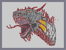
Dragon Head step 2
Hover over the thumbnail for a full-size version.
| Author | yungerkid |
|---|---|
| Tags | author:yungerkid n-art nonplayable rated |
| Created | 2008-07-02 |
| Last Modified | 2008-07-02 |
| Rating |
4 by 10 people.
|
| Map Data | |
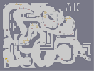
| Description | completed the shading, i made it black. my computer barely made it through this one. i was thinking of adding a background - if my comp can do it - any ideas for what i might have? i might try a cloudy sunset sky.
rce |
Other maps by this author
 |
 |
 |
 |
 |
 |
| Monstrosity | Thanksgiving | Gargantuan | Cutout Arcade | Juggernaut | Leviathan |
Comments
Pages: (0)

2008-07-23
4/5
I thought it was a really nice n-art. The only thing wrong with it was the ninjas. They don't look very good for n-art IMO. Still, the mines formed a realistic outline of the dragon.

2008-07-08
I
completely agree with Potassium Nitrate.
(aka KNO3)
Also a 2/5 from me, for exactly the reasons he gave. Keep at it, though!
(aka KNO3)
Also a 2/5 from me, for exactly the reasons he gave. Keep at it, though!

2008-07-04
hey there
You asked me something about my map "Imperfect Perfection".
Well, you can do with it whatever you want :P.
I'm honored.;)
Well, you can do with it whatever you want :P.
I'm honored.;)


2008-07-03
thanks so much
]{NO3. i appreciate your suggestions. i shall consider them for my next n-art (possibly the next step).


2008-07-02
$2/5
I think now is the time i should give you a few tips...
well the good:
- the fact that you used more than just mines.
the Bad:
-lack of 3d feel and shading.
-the ninjas make it look horrible
-the whole image looks flat
-never use drones in N-art unless you must. but almost any colour can be don using more 'placeable' objects.
tips:
-you should have done the whole dragon red, so it suits the outlines.
-that can be achieved by shading, placing turrets or rockets on top of the mines, making it darker.
- where you had edges or outlines you could have done rocket outlines.
-where you had spikes you could have used rockets or gauss turrets on the darker side and blank parts on the lighter side creating highlights.

2008-07-02
Good work :)
the only parts (besides finishing it) that could use work are the mouth (the two-tone interior is sort of "blah") and the teeth/gums of the lower jaw. I like the upper jaw, but the teeth on the bottom are not as pronounced. And maybe clean up the horns a bit. 4/5, I like it...though the concept is extremely tired.
2008-07-02
thanks
for the suggestion,
i'm not saying that i *will* be using the sunset idea for sure, but i'm looking for ideas.
i'm not saying that i *will* be using the sunset idea for sure, but i'm looking for ideas.

2008-07-02
sham?
you rated one of *my* maps? how nice! i'm glad.
i had thought that the black was kinda ugly looking in the thumbnail, but i'm glad it isn't.
i think gold skies are too overused. i will be using gold in the sunset idea, but with mines and bounceblocks too.
i had thought that the black was kinda ugly looking in the thumbnail, but i'm glad it isn't.
i think gold skies are too overused. i will be using gold in the sunset idea, but with mines and bounceblocks too.
2008-07-02
forgot to say
i like how i looks like there are scales on the neck
2008-07-02
whoa nice n-art
5/5
for the sky maybe gold? i dont know
for the sky maybe gold? i dont know
Riobe
Damnit yungerkid!!!
And yes, this entire dragon thing has probably been done before more than any other concept. Still, I think you should finish it.