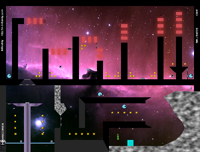
Space Headquarters
Hover over the thumbnail for a full-size version.
| Author | Skate1168 |
|---|---|
| Tags | author:skate1168 image-map imagemap medium nreality themed unrated |
| Created | 2010-06-08 |
| Last Modified | 2010-06-09 |
| Rating | 2 more votes required for a rating. |
| Map Data | |
| Description | 
You are reading this becuase either you think this map is awesome, or I sent you a link to it on one of your maps (I sent links to BluePretzel and Invalid). BTW, this map is awesome! Okay, I know I have been inactive for a while, but I am still here. No, I did not leave NUMA, life was just a little busy. I plan to make maps more regularly again, so I will be online more! I worked for 3 days on this map! I spent countless hours adjusting the gameplay and graphics! If this imagemap doesn't satisfy you, I don't know what will! I used this the tileset "Headcourters Tileset [nmaps.net]" by Woot16 [nmaps.net]. P.S. Look who's back! That green ninja from Sith Fortress [nmaps.net]! *use nreality* |
Other maps by this author
Comments
2010-06-09
Dont delist!
Why dude? Who gave you a friking 1 star?! 4/5
2010-06-08
AGD -1
This is actually quite well made. The image quality, although simple, still sets the theme that I enjoyed. I also liked those red parts at the top. Why did you delist though?
4/5.
4/5.
| Demo Data |
|---|
the grey parts were a bit blurry, and the button tileset could use a little work. ndevour's being a bit mean :p
2010-06-08
[IMG] use on NUMA.
New rules regarding this, please take heed.
For image maps, showing your fellow users a representation of your map is a good way to entice them in. However, we don't need a full size image for this (it contorts the page and looks obnoxious). Therefore, the restriction is placed at 400x303 (this is a relative reduction for the full size image).
This size reduces the negative impact of the image itself while retaining enough detail to represent your image map well.
All other images should be kept below this maximum also.
Thank you.


Lightning55
I like the art of this one.