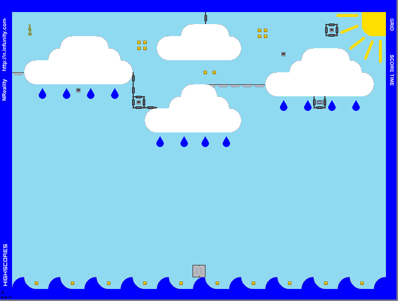
Sky and Water
This map has been removed from listings.
Hover over the thumbnail for a full-size version.
| Author | Skate1168 |
|---|---|
| Tags | author:skate1168 customicon image-map imagemap nreality rated tileset |
| Created | 2010-02-02 |
| Last Modified | 2010-02-02 |
| Rating |
3 by 7 people.
|
| Map Data | |
| Description | Image Map Preview:

This is my second image map (made with GIMP, you can find a tutorial on how to make image maps in GIMP here. [s3.zetaboards.com] I also used custom icons which you can learn how to do here. [n.wikia.com] I spent two days working on this map with a lot of effort. I hope you enjoy this map. Please rate and comment |
Other maps by this author
Comments
Pages: (0)
2010-03-12
jeez
0000000000000000000000000000000000000000000000000000000000001OOOOOO0000000000000000000000QQQ00000000000000000000000000000000000000000000000000000000000000000000000000000000000000000000000000000000000000000000000000000000000000000000000000000000000000000QQQQQQQ100000000000000000000O0000000000000000000000QQQQQQQ000000000000000000000000000000OO00000000000000000000O1O000000000000000001QQQ0QQQ0000000000000000000000000000000000000000000000000000000000000000000000000000000000000000000000000000000000000000000000000000000000000000000000000000000000000000000000000000000000000000000000000000000000000000000000000000000000000000000000000000000000000000000000000000000000000000000000000000000000000000000000000000000000|10^318,180
2010-03-12
screw that
sunset isn't on. You wanna start the tiles?
2010-03-12
Wants to collab?
>:O
2010-03-12
my mistake
looks completely different xD
2010-02-03
sure i guess
but you must credit me, tag it 'chaosdrone' and send me a link. It should mainly only be used in a open space with lots of shelter where you can't seem to make that map hard enough.
Usually.
Usually.
2010-02-02
yeah
the image is just irritating in this, as it is with most imagemaps these days. definitely focus on the gameplay and base aesthetics first, before you start fiddling with an image. all those doors look very ugly, and the gold is poorly placed and generic. play other maps and get some ideas from there. model your maps around other good maps, for example, to start.
2010-02-02
i agree
with lightning
2010-02-02
This thing hurts my eyes playing
and there are too many rockets. The level is designed poorly. The bottom floor is too hard to move on.
The theme isn't everything. Focus on a theme, but don't strictly restrict the map in doing so. Going back and forth with 4 rockets isn't interesting. 2 rockets would have sufficed in this instance.
AGD below.
The theme isn't everything. Focus on a theme, but don't strictly restrict the map in doing so. Going back and forth with 4 rockets isn't interesting. 2 rockets would have sufficed in this instance.
AGD below.
| Demo Data |
|---|
2010-02-02
The thump/raindrop
mechanic is cool. Otherwise, this was a 3.5


Invalid
started things off